Roc Grotesk Font Family

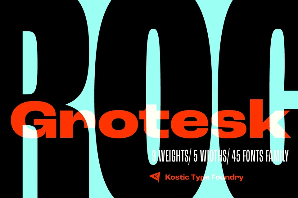
Roc Grotesk is a versatile sans-serif typeface designed by Nikola Kostić and released in 2012 through the Kostić Type Foundry, a Serbian foundry operated by Nikola and his father, Zoran Kostić. The design draws inspiration from late 19th-century American wood types, resulting in a modern grotesque style that balances functionality and aesthetic appeal.
Font Family Overview
The Roc Grotesk font family comprises nine weights (from Thin to Heavy) and five widths (Compressed, Condensed, Normal, Wide, and ExtraWide), totaling 45 distinct styles. This extensive range allows for flexibility in design applications, accommodating both display and text settings. The character set supports various languages, including Western and Central European languages, as well as Turkish.
Design Features
- Contrast and Proportions: The font features low contrast details, making it suitable for small text applications. The heavier weights exhibit a more pronounced stroke contrast, particularly noticeable in uppercase letters like “E” and “R” in the Black and Heavy styles.
- Usability: The Normal width maintains proportionality across styles, while the Compressed width is designed for efficiency in horizontal space, which is particularly useful for tight layouts.
- OpenType Features: Roc Grotesk includes stylistic alternates for certain characters, such as a single-story “g” and a cut-off “r,” enhancing its usability for designers seeking a traditional grotesque aesthetic.
These combinations enhance the overall design and readability in various contexts, making Roc Grotesk a popular choice among designers.
Designed by:Nikola Kostić
License: Free for personal use
