15 Best Sans Serif Fonts
Sans serif fonts have become a staple in modern design, favored for their clean lines and versatility. Originating in the 18th century, these typefaces have evolved significantly, adapting to the needs of digital and print media alike. The term “sans serif” translates to “without serif,” indicating the absence of the small decorative strokes at the ends of letters found in serif fonts. This simplicity enhances readability, making sans serif fonts ideal for various applications, from branding to user interfaces.In an era where visual communication is paramount, the choice of typeface can greatly influence a brand’s identity and message. Sans serif fonts are particularly effective in conveying a contemporary, approachable aesthetic, which is why they dominate the digital landscape. With their ability to maintain legibility across different screen sizes and resolutions, they are often the preferred choice for web content. This article will explore the best sans serif fonts available today, highlighting their unique characteristics and applications, and providing insights into how they can elevate your design projects.
15 Best Sans Serif Fonts
Helvetica Now
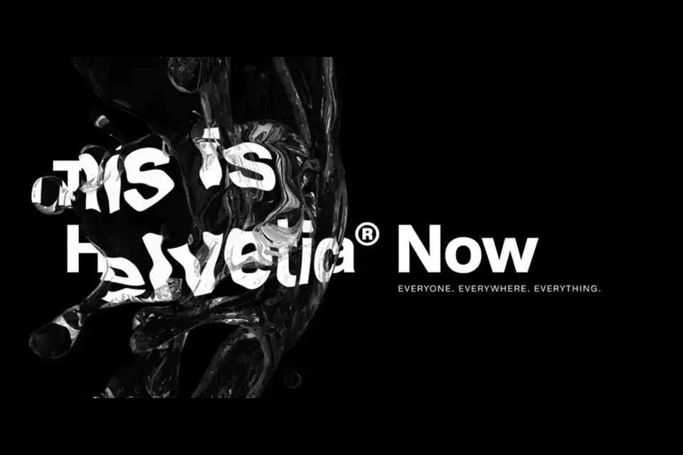
Helvetica is a classic and widely recognized sans serif font, known for its clean, modern appearance. The updated version, Helvetica Now, enhances its legacy with improved legibility and a wider range of weights, making it a favorite for branding and design.
Proxima Nova
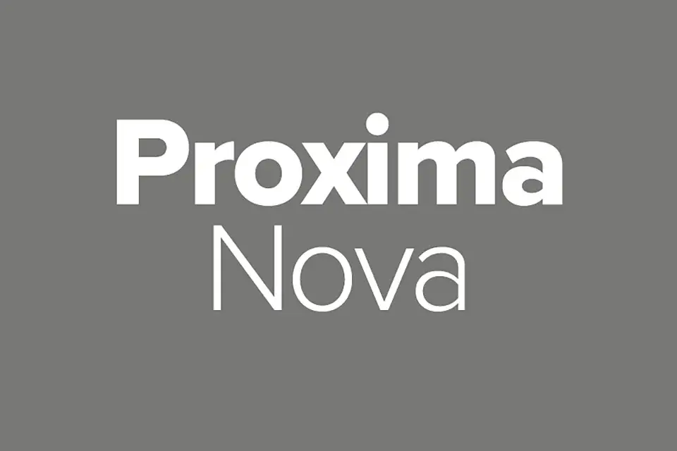
Proxima Nova merges modern proportions with a geometric appearance, making it versatile for both web and print. Its extensive weight range allows for creative flexibility, making it popular among designers for various applications.
Futura

Designed in 1927, Futura is a geometric sans serif that embodies modernity. Its circular forms and sharp angles create a striking visual impact, making it suitable for branding and advertising.
Roboto
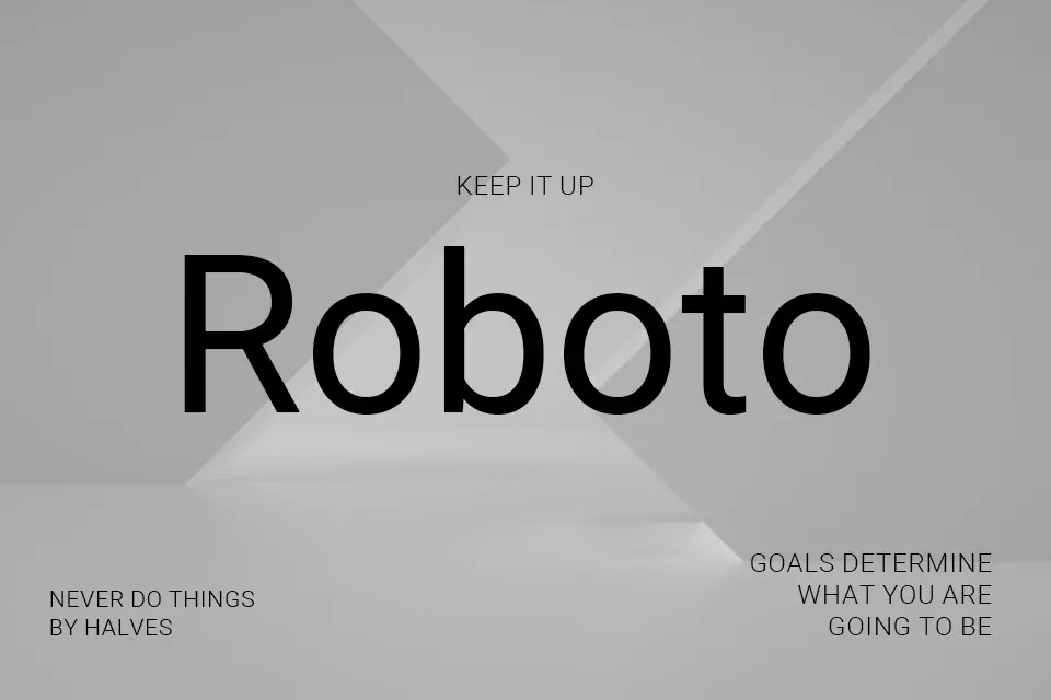
Developed by Google, Roboto is a neo-grotesque sans serif that balances friendly curves with a professional demeanor. It is widely used in digital interfaces and is known for its readability across different devices.
Avenir
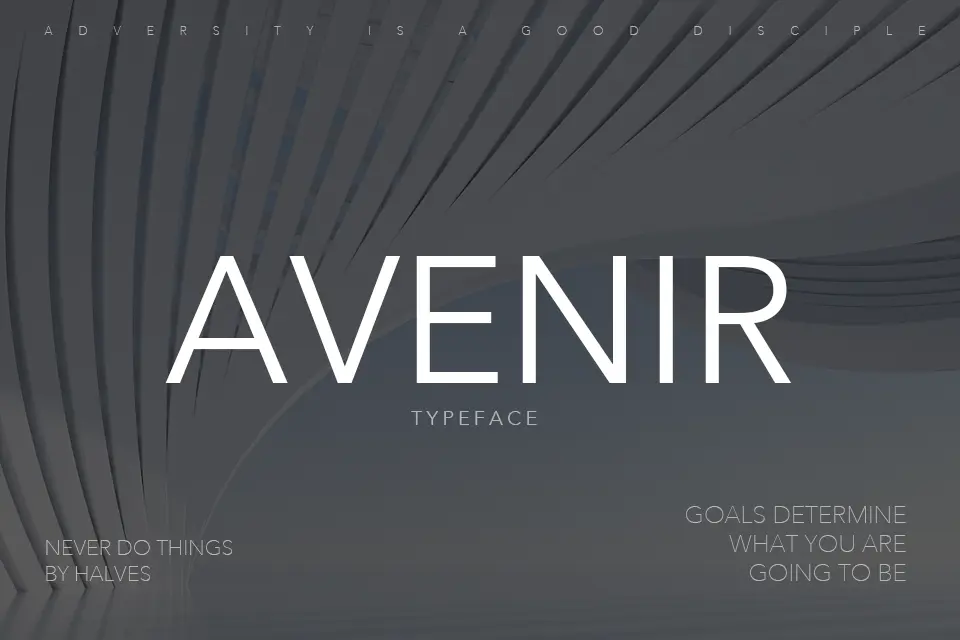
Avenir, designed by Adrian Frutiger, combines geometric shapes with humanist qualities. Its harmonious proportions make it ideal for both headlines and body text, offering a timeless look.
Lato
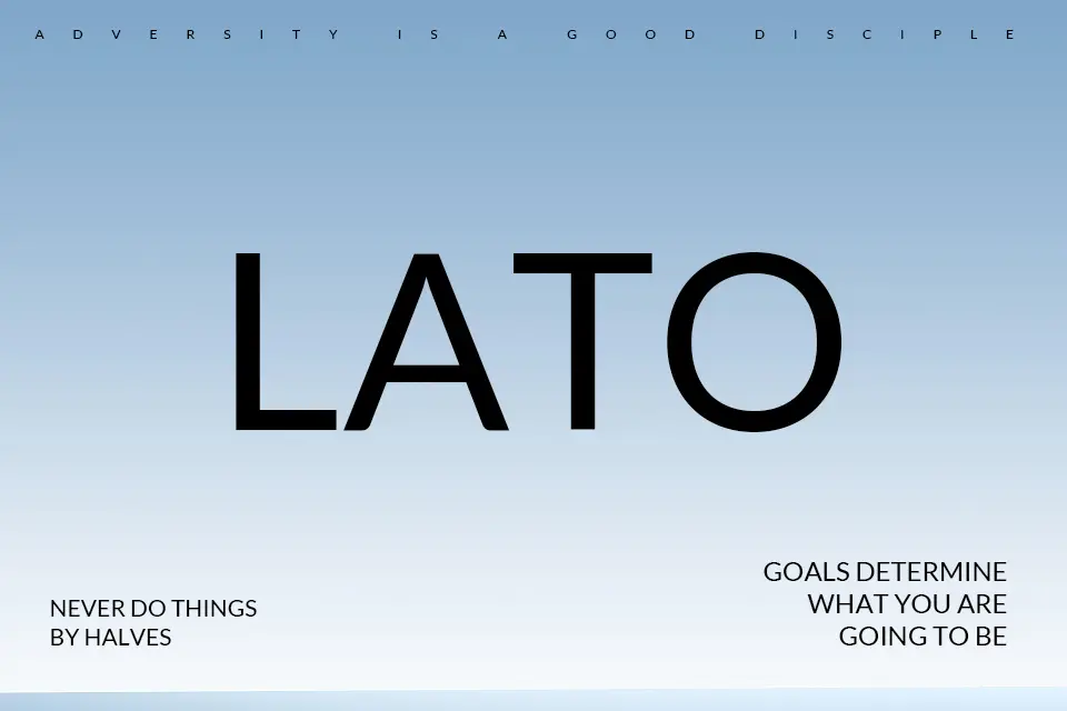
Lato is a popular sans serif font that features a warm and inviting appearance. Its versatility and range of weights make it suitable for various design projects, from websites to print materials.
Open Sans
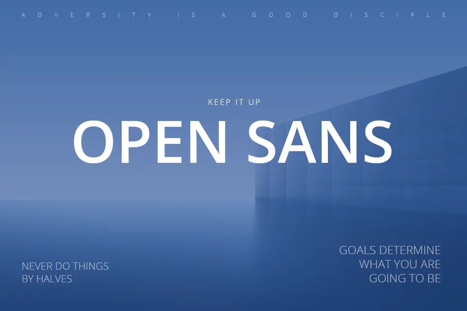
Open Sans is known for its neutral yet friendly appearance. Designed for legibility on screens, it is widely used in web design and is favored for its simplicity and clarity.
Montserrat
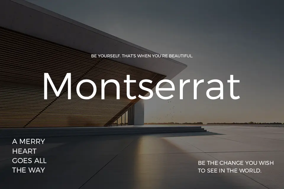
Inspired by traditional signage in Buenos Aires, Montserrat features a modern geometric style. Its bold and distinctive letterforms make it a great choice for headlines and branding.
Gotham
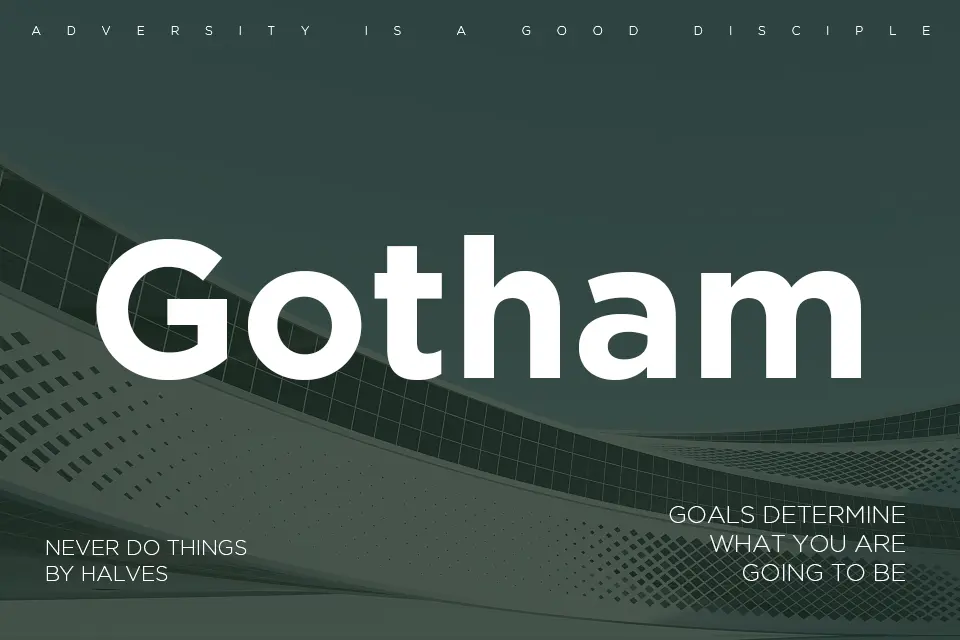
Gotham is a geometric sans serif that has gained popularity in both print and digital media. Its clean lines and modern aesthetic make it a favorite for corporate branding and advertising.
D-DIN
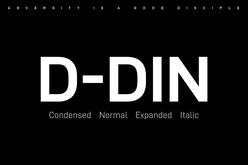
D-DIN is a sans serif typeface known for its industrial look. Originally designed for signage, it is now widely used in various design contexts, offering a strong and authoritative presence.
Source Sans Pro
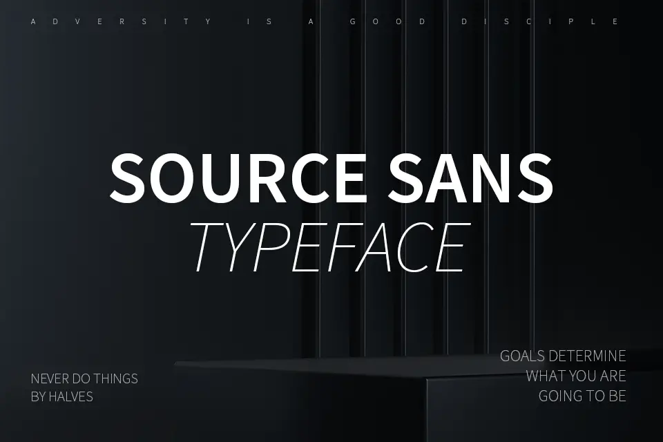
As Adobe’s first open-source typeface, Source Sans Pro is designed for user interfaces. Its legibility and clean lines make it an excellent choice for digital applications.
Raleway
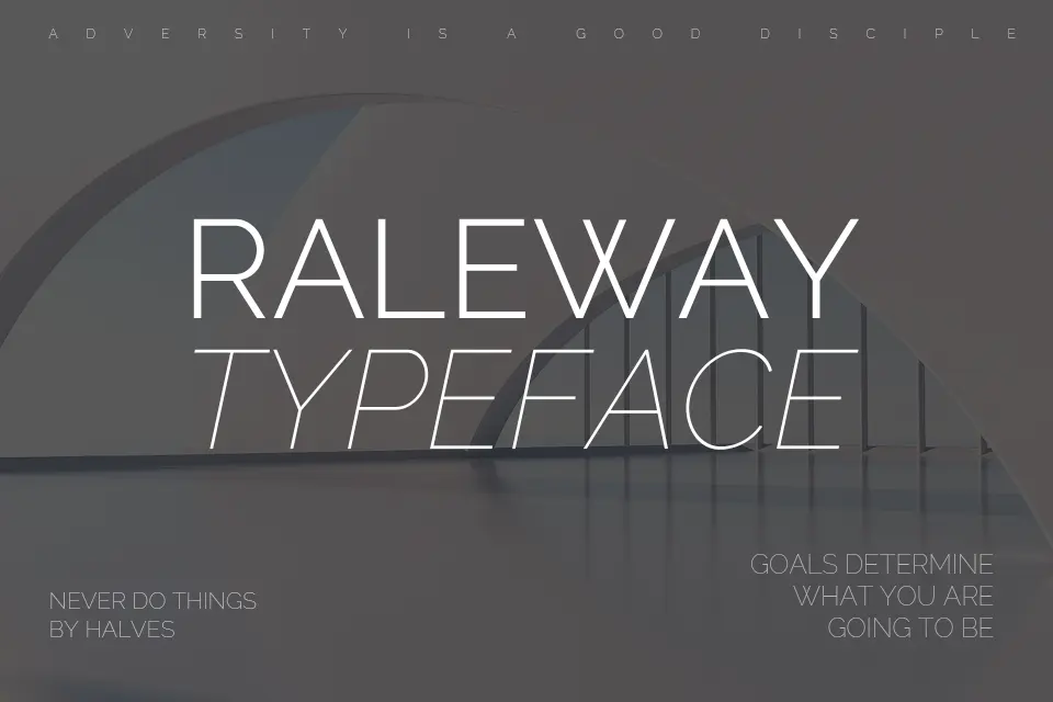
Raleway is an elegant sans serif font that features a thin, modern style. It is often used for headings and branding, providing a sophisticated touch to any design.
Noto Sans
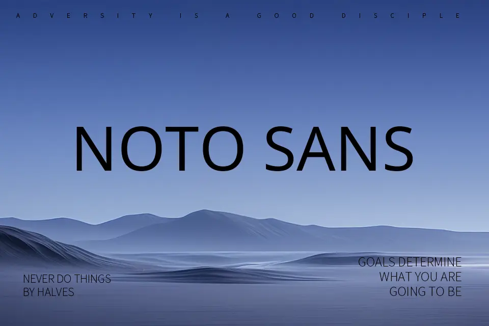
Noto Sans is part of Google’s Noto font family, designed to support multiple languages and scripts. Its clean and modern design makes it suitable for global applications.
Gilroy
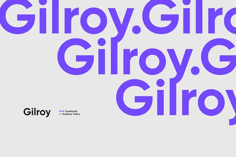
Gilroy is a modern sans serif with a geometric flair. Its extensive weight options and contemporary aesthetic make it ideal for branding and advertising.
Poppins
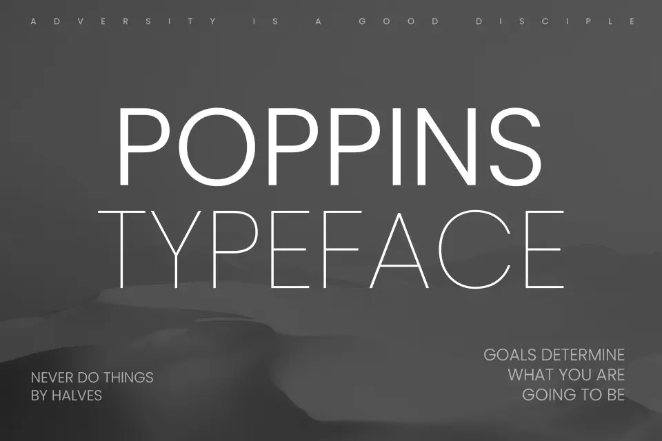
Poppins is a geometric sans serif that features rounded edges and a friendly appearance. Its versatility makes it popular for both print and digital design, especially in modern branding.
Conclusion
In conclusion, sans serif fonts are an essential tool for designers, providing clarity and modernity in various applications. Their versatility allows them to adapt to different contexts, making them suitable for everything from corporate branding to creative projects. By understanding the unique characteristics of each font, designers can make informed choices that enhance their visual communication.
FAQs
What are sans serif fonts?
Sans serif fonts are typefaces that do not have the small decorative strokes at the ends of letters, known as serifs. They are characterized by their clean and modern appearance.
Why are sans serif fonts popular?
Sans serif fonts are popular due to their legibility, simplicity, and versatility. They work well in both digital and print media, making them ideal for a wide range of applications.
Can I use sans serif fonts for body text?
Yes, sans serif fonts are often used for body text, especially in digital formats, as they tend to be more readable on screens.
Are sans serif fonts suitable for branding?
Absolutely! Many brands choose sans serif fonts for their logos and marketing materials because they convey a contemporary and approachable image.
How do I choose the right sans serif font for my project?
Consider the tone and message of your project, as well as the target audience. Experiment with different weights and styles to find a font that aligns with your design goals.