Futura Renner Font Family
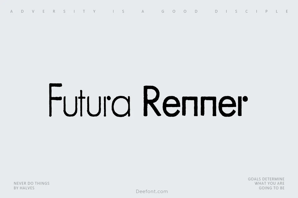
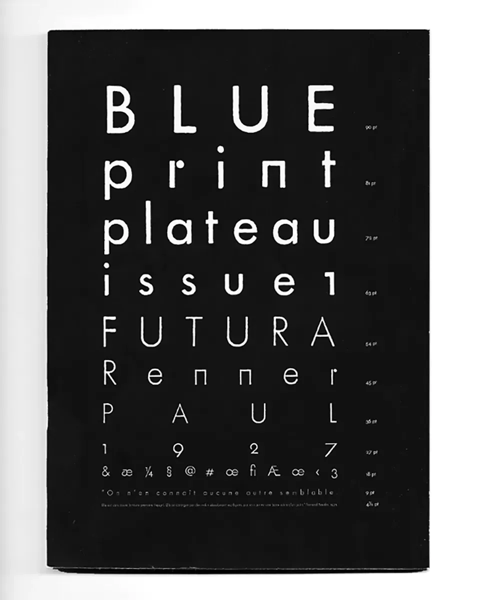
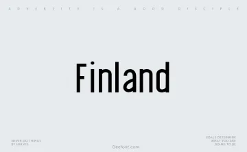
Futura Renner Font Family presents a unique historical interpretation of the iconic Futura typeface, tracing its origins to early 20th-century typographic experiments. Developed as a digital revival of lead type characters preserved at Brussels’ École Nationale Supérieure des Arts de la Cambre, this geometric sans-serif design showcases distinctive features like perfectly straight vertical strokes in letters such as m and n, along with a striking r composed of a horizontal bar and detached circular element. Available in Light and Regular weights, the font family balances geometric precision with subtle organic imperfections inherited from its analog origins. These irregularities, captured through vectorized imprints of original metal type, lend text an understated tactile quality rarely found in digital fonts. The design’s multilingual support and clean aesthetic make it particularly effective for editorial layouts, architectural branding, and projects requiring modernist sophistication with historical resonance. Maintained as open-source software through collaborative development, Futura Renner bridges vintage typographic craftsmanship with contemporary design needs.
Designed by:BSozooWebsite
License: Free for commercial useOFL