Gopher Font Family

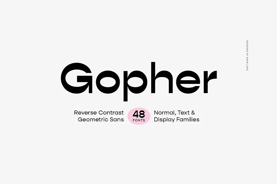
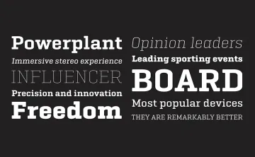
Gopher is a modern, reverse contrast, geometric sans serif font designed by Adam Ladd in 2019. The font family includes 48 styles, ranging from hairline to heavy weights, and features both normal and display types. Gopher’s unique design reverses traditional typographic contrast, making horizontal strokes thicker than vertical ones. This innovative approach creates a distinctive visual appeal suitable for various applications, including branding, advertising, and editorial design. With extensive Latin language support and numerous OpenType features, Gopher is versatile for both digital and print media.
Features of Gopher Font Family:
- 48 Font Styles: Includes hairline, thin, light, regular, medium, bold, black, and heavy weights with matching italics.
- Optical Sizes: Available in three optical sizes—normal, text, and display—each with varying contrast levels.
- OpenType Features: Swash capitals, stylistic alternates (for certain characters), ligatures (standard and discretionary), case-sensitive punctuation for all caps, fractions, superscripts, and subscripts.
- Extensive Glyph Support: Over 600 glyphs supporting more than 100 Latin languages.
- Compatibility: Works well with major design software like Adobe Creative Suite and Microsoft Office.
Gopher is available for commercial use through Adobe Fonts as part of their subscription service.
FAQs about Gopher Font Family:
Is Gopher free for commercial use?
Gopher is not free; it is available through Adobe Fonts with a subscription that allows commercial use.
What are the main uses for Gopher?
Gopher is ideal for branding, advertising, posters, magazines, packaging, and various digital applications.
How many styles does the Gopher font family include?
The Gopher font family includes 48 styles across different weights and optical sizes.
What software can I use Gopher with?
Gopher works well with most graphic design software including Adobe Creative Suite (Photoshop, Illustrator) and Microsoft Office applications.
What is reverse contrast in typography?
Reverse contrast means that the horizontal strokes of the letters are thicker than the vertical strokes, creating a unique visual effect that distinguishes Gopher from traditional typefaces.
Designed by:Adam Ladd
License: Free for personal use
