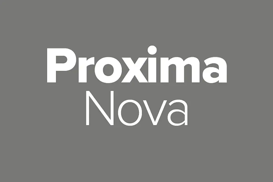
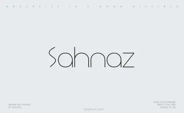
Proxima Nova Font

Proxima Nova Font Family is a versatile geometric sans-serif font designed by Mark Simonson. It combines modern proportions with a clean, geometric appearance, bridging the gap between typefaces like Futura and Akzidenz Grotesk. Originally released in 1994 as Proxima Sans, the font has since been expanded into a full-featured family of 198 fonts across seven weights, five widths, and matching italics.
Key Features of Proxima Nova:
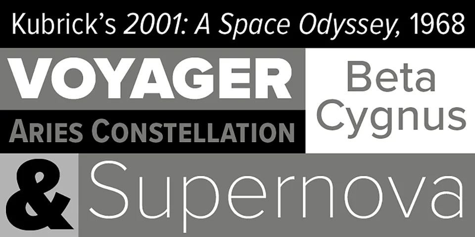
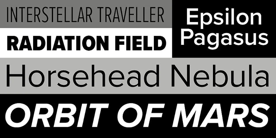
- 198 fonts in 7 weights (Thin, Light, Regular, Medium, Semibold, Bold, Black) and 5 widths (Normal, Condensed, Extra Condensed, Wide, Extra Wide) with matching italics
- Supports Greek, Cyrillic, Vietnamese, and numerous currency symbols
- Includes small caps, case-sensitive forms, lining and old style figures, ligatures, and alternate characters
- Available in OpenType format for use with Adobe Creative Cloud and other applications
Is Proxima Nova free for commercial use?
No, Proxima Nova is not free for commercial use. The font is available for purchase from Mark Simonson Studio. For commercial use, you need to obtain an extended or enterprise license.
FAQs
What inspired the design of Proxima Nova?
Proxima Nova was inspired by the lettering styles of the 1970s, with an Art Deco-like appearance. The designer, Mark Simonson, also cites Futura and Akzidenz Grotesk as influences.
How has Proxima Nova been used in design?
Proxima Nova has been used extensively in web design, with millions of websites using the font as of the mid-2010s. It has also been used in print publications, titles, and subtitles.
What makes Proxima Nova stand out from other geometric sans-serif fonts?
Proxima Nova combines the strength of modernism found in Helvetica with the softer, more geometric feel of Futura. The lowercase “i” with a circular dot is one distinguishing feature compared to Helvetica’s square dot.
How has Proxima Nova evolved since its initial release?
Since its initial release in 1994 as Proxima Sans, the font has been continually updated and expanded by Mark Simonson. The character set has more than doubled, and support for additional writing systems like Arabic, Devanagari, and Thai has been added.
What is the difference between Proxima Nova and Proxima Vara?
Proxima Vara is a variable font version of Proxima Nova that is available separately. Variable fonts allow for continuous interpolation between different font styles, enabling more flexibility in font selection and usage.
Designed by:Mark Simonson Website
License: Free for personal use
