What Font Does Youtube Use
YouTube’s choice of fonts is a significant aspect of its branding and user interface design. As a platform that serves billions of users worldwide, the fonts used must be legible across various devices and screen sizes while maintaining a consistent and recognizable appearance. This article explores the fonts YouTube employs, their evolution, and their impact on user experience.
Background Information
YouTube was founded in 2005 and has since grown into one of the largest video-sharing platforms globally. From its inception, the design choices made by YouTube have played a crucial role in its identity and user engagement. The selection of fonts is particularly important, as they contribute to the platform’s aesthetic and functional aspects. Initially, YouTube utilized a simple sans-serif typeface that aligned with the minimalist web design trends of the early 2000s. However, as the platform evolved, so did its typography, reflecting broader design trends and user feedback.In 2011, YouTube introduced a custom typeface named “YouTube Sans,” which provided a cleaner and more contemporary look. This was part of a broader redesign aimed at enhancing readability and user experience. By 2017, YouTube Sans was further refined in collaboration with design agencies, resulting in a unique identity that distinguished it from other platforms while ensuring clarity across all screen sizes. Today, YouTube employs multiple fonts, including YouTube Sans, Roboto, and others, each serving specific purposes within the platform.
The Fonts Used by YouTube
YouTube Sans

YouTube Sans is the custom font created specifically for YouTube. Launched in 2017, this font was developed in collaboration with design agencies to create a distinctive visual identity for the platform. The design of YouTube Sans takes inspiration from the iconic play button, integrating similar angles into the letterforms. This font is primarily used in marketing materials and branding efforts, helping to establish YouTube’s identity in a crowded digital landscape.
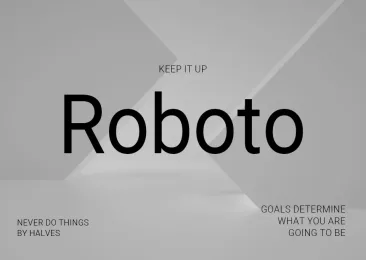
Roboto
For video titles, comments, and descriptions, YouTube predominantly uses Roboto, a sans-serif typeface designed by Google. Roboto is known for its modern and clean appearance, making it highly legible across various devices. This font was chosen for its versatility and adaptability, ensuring that users can easily read text regardless of the screen size or resolution. Roboto is also widely used in other Google services, reinforcing a cohesive brand experience across platforms.
Other Fonts
In addition to YouTube Sans and Roboto, YouTube also employs other fonts for specific purposes. For instance, Arial is sometimes used for text elements that require a more traditional appearance. The choice of font can vary depending on the context, such as thumbnails, video descriptions, and user comments.
The Evolution of YouTube’s Fonts
YouTube’s typography has undergone several changes since its launch. The initial font was straightforward and functional, reflecting the platform’s primary goal of easy video sharing. As design trends evolved, YouTube recognized the need for a more modern and visually appealing interface.
- Early Years (2005-2010): The original font was a simple sans-serif typeface that prioritized functionality over aesthetics. This choice aligned with the minimalist web design trends of the time.
- Introduction of YouTube Sans (2011): The platform underwent a significant redesign, introducing YouTube Sans. This custom font provided a cleaner, more contemporary look, enhancing readability and aligning with the growing trend of flat design.
- Refinement of YouTube Sans (2017): In response to user feedback and design advancements, YouTube Sans was refined in collaboration with design agencies. This iteration aimed to create a unique identity for YouTube, distinguishing it from competitors while ensuring clarity across devices.
- Current Usage: Today, YouTube employs both YouTube Sans for branding and Roboto for functional text. This combination reflects a commitment to user experience and brand identity.
Impact of Font Choice on User Experience
The choice of fonts on YouTube significantly impacts user experience. A well-chosen font enhances readability, making it easier for users to engage with content. Fonts like Roboto are designed to be legible across various devices, ensuring that viewers can easily read video titles, descriptions, and comments.Moreover, the use of a custom font like YouTube Sans helps establish a unique brand identity. This differentiation is crucial in a competitive digital landscape, where users are bombarded with content from various platforms. A recognizable font can enhance brand recall and create a sense of familiarity for users.
Accessibility Considerations
YouTube’s font choices also consider accessibility. By utilizing fonts that are easy to read, the platform ensures that content is accessible to a broader audience, including those with visual impairments. This commitment to inclusivity is essential for fostering a positive user experience.
Conclusion
YouTube’s font choices, particularly the use of YouTube Sans and Roboto, play a vital role in shaping the platform’s identity and enhancing user experience. The evolution of these fonts reflects broader design trends and user feedback, demonstrating YouTube’s commitment to staying relevant in a rapidly changing digital landscape. As the platform continues to grow, its typography will remain a crucial element of its branding and user engagement strategies.
FAQs
1. What is the main font used by YouTube?
YouTube primarily uses YouTube Sans for branding and Roboto for video titles and comments.
2. Can I download YouTube Sans?
Yes, YouTube Sans can be found online. However, ensure you have the proper licensing for any commercial use.
3. Why does YouTube use different fonts?
Different fonts are used to enhance readability, establish brand identity, and cater to various content types across the platform.
4. How has YouTube’s font changed over the years?
YouTube has evolved from a simple sans-serif typeface to a custom font (YouTube Sans) and the widely recognized Roboto, reflecting design trends and user feedback.
5. What are some alternatives to YouTube’s fonts?
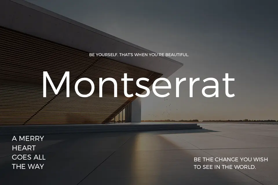
Alternatives to YouTube’s fonts include Arial, Montserrat, and Bebas Neue, which can be used for similar purposes in video content and branding.